|
by kirupa |
2 June 2007
In the
previous page, you started to create the Label
component to display some text. We'll finish up work on our
label and discuss animation.
- Right now, the text in our Label is too small to
read, and the dark text color is not visible on our dark
background. Let's change that. Make sure your label is
selected, and look at your Properties panel on the
right-hand side. Find the panel marked Text:
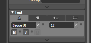
[ the Text panel allows you to modify your Label control's
properties ]
In this Text panel, we will change the
text size. Notice that the font-size drop-down menu currently
displays the default size of 12. Change the value from 12 to
72 by either typing 72 after clicking on the 12 or by
selecting 72 from the drop-down menu:
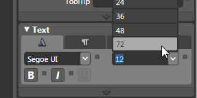
[ increase the font size to 72 ]
- After changing the font size to 72, let's change the
text color to a shade of white. With your Label still
selected, look in your Brushes panel and change the
Foreground color to White:
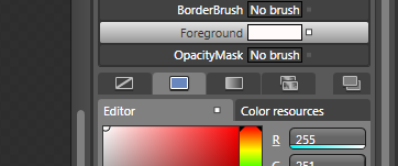
[ change your text's color by modifying the Foreground
property ]
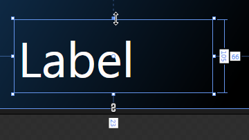
- Right now, your label's text should both be larger
and lightly colored than it was a few steps earlier. If you set your label's initial
size to be too small, you'll find that the text in your
Label doesn't fully display:
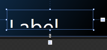
[ if you initially sized your Label control too small, the
text will be cut-off ]
To fix the sizing issue, there are two things you can do. You
can make your font size smaller, or you can resize
your Label control to display all of your text. For this
tutorial, if your text is cut-off, resize the label control
to make sure all of the size 72 text fits:
[ resize the label control to make sure all of your text
fits ]
- We are almost done customizing our Label control.
The last thing to do is change the default text from
Label to something else. Right click on your Label
control and select Edit Text:
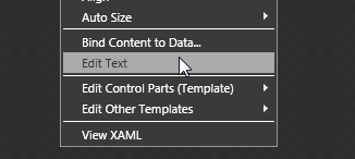
[ select Edit Text to change the text that is displayed in
your Label control ]
Your text will now be selected. Type the
word Blend and click anywhere else in the
Artboard to accept the change:
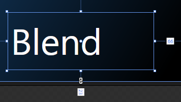
[ change the text inside your label to
Blend ]
The last page of this tutorial will
describe how to insert a Label control where the control
resizes itself automatically based
on the text inside it.
Your Label component is now ready. The next step is to
animate this control, but before we dive right in, I think
it is useful to think about how animation works in WPF.
When creating animations, you need an object to animate. In
our animation example, some of the animated objects included
text and various circles. An object alone does not make an
animation, though. You need to also specify how your object
will vary at different time states. For example, your object
may start off small, but at a later time, it is made much
larger. The animation would involve showing how the object
grows from its initial small size to its final large size.
The actual animation part is handled by Blend itself. All
you have to do is specify how your object looks at a
beginning time and an ending time. One way of looking at this is
you take a snapshot of how your object is at Time 0. You
then make various modifications to your object and take
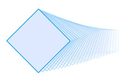
another snapshot at a later time such as Time 1:
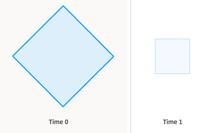
As shown in the above image, at Time 0, you
have a square that you have tilted on a corner. At Time 1,
you take the same square, rotate it, scale it down in size,
make it more transparent, and move it to your right. By
themselves, both of these object states are pretty boring.
When animated though, things become interested. Don't worry,
though, WPF takes care of the animation where all the
intermediate frames are generated for you automatically.
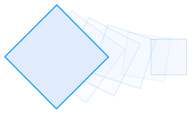
Internally, the following image shows how WPF perceives
and generates the intermediate sequences of
your square between Times 0 and 1:
Times 0 and 1 are arbitrary times that I picked to
describe times for the starting and ending states. WPF's
animations are time-driven, so if your animation needs to
take 2 seconds, then it will try its best to start and end
the animation at exactly two seconds. The frame rate during
this phase isn't fixed at a particular number, but it varies
depending on what the computer is capable of.
The duration you specify for your animation determines
how fast your animation actually will seem. If your time
between states is really short, then your animation will
seem very fast because you have little time to go from the
initial to the final state:
If your duration is large, then your animation will take
longer to complete because you now have more time to go from
the initial state to the final state:
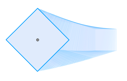
With the longer duration, WPF generates more intermediate
frames because the eye will need to perceive more
intermediate changes to simulate a smooth transition.
For information on frame
rates and what causes our eyes to see smooth animation, check out my blog post on this topic
here.
To summarize, you first need an object that needs to be
animated. It may be a square as in the above images, or it
could be some text or circles as it was in the example on
the first page. Once you find an object that you wish to
animate, you need to specify the starting and ending states
and the duration/running time your animation will follow.
Don't sweat the details (yet!), for the following sections
will guide you through creating a simple animation using
Blend.
Onwards to the
next
page!
|
 Introduction to Blend: Animation - Page 2
