|
by kirupa |
30 June 2007
Customizing the Window in the
previous page is only a small part of what we aim to
accomplish in this tutorial. Let's make our application more
useful by adding ready-made components called Controls in
this and the next page.
Controls are ready-made reusable components that are
designed to make your life easier. In almost all
applications, certain components are guaranteed to make an
appearance such as Buttons for clicking, Text Fields for
gathering input, etc. These
components are so frequently used, that in order to save you
the hassle of creating them yourself, WPF comes
with many controls ready for you to use out of the box.
In this section, we will learn how to use two such controls - Label and
Button - to display some text and add interactivity to our
application.
The Label control is one of the primary controls you will
use for displaying simple text-based information. The
following steps take you through adding and customizing the
control for this application.
- Let's first add our Label component. Click on the
Document/Text category in your Toolbox to display a
fly-out menu with controls related to using text:
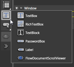
[ expand the sub-group of Document/Text controls ]
- From this fly-out menu, select the Label control.
As you see in the above picture, it is the second to
last control displayed. Once you have selected your
Label control, the icon for your Document/Text category
will be the Label:
[ your Document/Text category's icon is now the Label ]
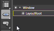
- Double-click on your Document/Text category, and
since the Label is now the displayed icon for it, a default
Label control will be added to your Artboard in the
default top-left location in its Edit Text mode:
[ you'll be in the text editing mode by default when you
first add your Label ]
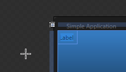
Click elsewhere in your Artboard to leave
the Edit Text mode and enter the more familiar Selection
mode:
[ click elsewhere to remove focus from the text editing mode
]
- What we want is for our control to be centered in
our window with the large font and white-colored text as
shown in our example window. Let's look at centering and
vertically positioning your text first.
There are two ways to do this. One way is to simply drag
your Label to the appropriate location in the window.
The second way which I will cover in this tutorial is
how to use the various alignment properties.
With your Label still selected, find the Layout panel
located in your Properties panel:
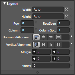
[ your Layout panel provides graphical access to WPF's
layout functionality ]
- In the Layout panel, find the two sections marked
HorizontalAlignment and VerticalAlignment. You can even
find them in the above image. For both
HorizontalAlignment and VerticalAlignment, click the
Center button (the second of the four buttons):
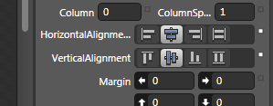
[ press the Center button for Horizontal and Vertical
alignment ]
After you have clicked the Center button
for both the Horizontal and Vertical alignment, you will find
that your label is now centered horizontally and vertically
inside the window:
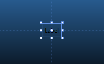
[ your label is now centered in your window ]
- We are half-way done customizing our label!
Positioning has been resolved, so let's shift our focus
to the label text's font styles and color. With your Label
control still selected, find the Text panel under your
Properties panel:
[ the Text panel allows you to format how your text looks ]
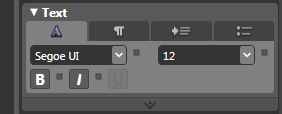
From your Text panel, you can adjust the
font and its related properties. Change the font size to 36,
click on the B button to Bold your text, and change the font
to something (anything!) else. I went ahead and changed my
font to Trebuchet MS, but you can use whatever font you want.
The following two images show how my Text panel and Label
now look like:
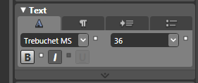
[ how your text panel might look like after making the above
changes ]
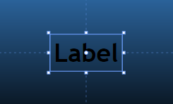
[ how your Label now looks after the Text modifications ]
Notice that your label now reflects what
your Text panel displays! The text is now a bit larger,
bolded, and shows your new font selection.
- Now, let's change the color of our label,
so let's run over to the Brushes panel. In your
Properties panel's Brushes panel, change the
Foreground property to a lighter color such as a light
blue:
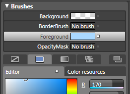
[ to change the color, you go back to your Brushes panel ]
- Your Label text will now display the light
blue color you picked in the Brushes panel. While we are
in this area, let's go ahead and change the Label's
name. From
the same Properties panel, directly above your Brushes
panel, find the
Name field:
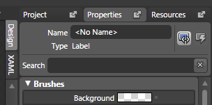
[ your Name property refers to what your label will be
called ]
The Name field right now should display
the default <No Name> text. We want to change that to TextLabel,
so click on the <No Name> text field and replace the
selected text to TextLabel:
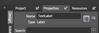
[ give your label the name TextLabel ]
- The final step is to now remove the default Label
text from our Label control. Right click on your Label
and select Edit Text:
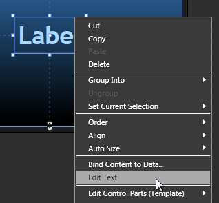
[ to edit your Label's text, right click on it and select
Edit Text ]
- After you have selected Edit Text, you will see the
Label control's text highlighted for editing:

[ your Label text is selected - almost like when you first
added your Label ]
With your text highlighted, hit your
Backspace or Delete key to get rid of the text. We will
provide the text later using code, and the only reason we
kept this text for this long was to see how our text
modifications change how the text looks like.
Once you have deleted your text and clicked elsewhere to
remove focus from the Label's text field, this is what your
Label control now looks like:
[ what your Label control looks like with the default text
removed ]
Ok, you have successfully added and formatted your Label.
In the
next page, let's add our next (and final!) control, the
Button.
Onwards to the
next page!
|
 Creating a WPF App Using Blend - Page 3


